Dunkin Recycling Logo Shorts
Typography / Motion / Campaign
The value of the project is that people can use the brand's packaging as an opportunity to engage in new artistic creation, and the intention is to make people more comfortable with typography by showing them new visuals of materials they encounter in their daily lives.
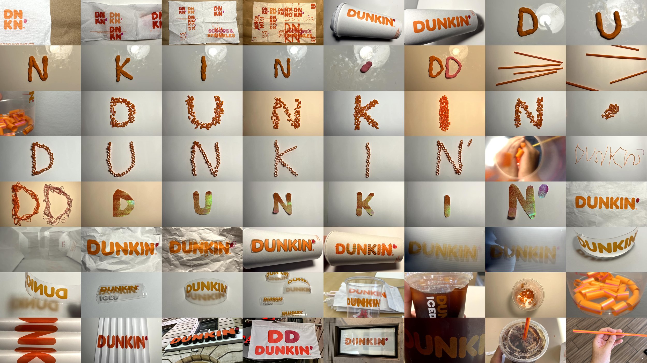
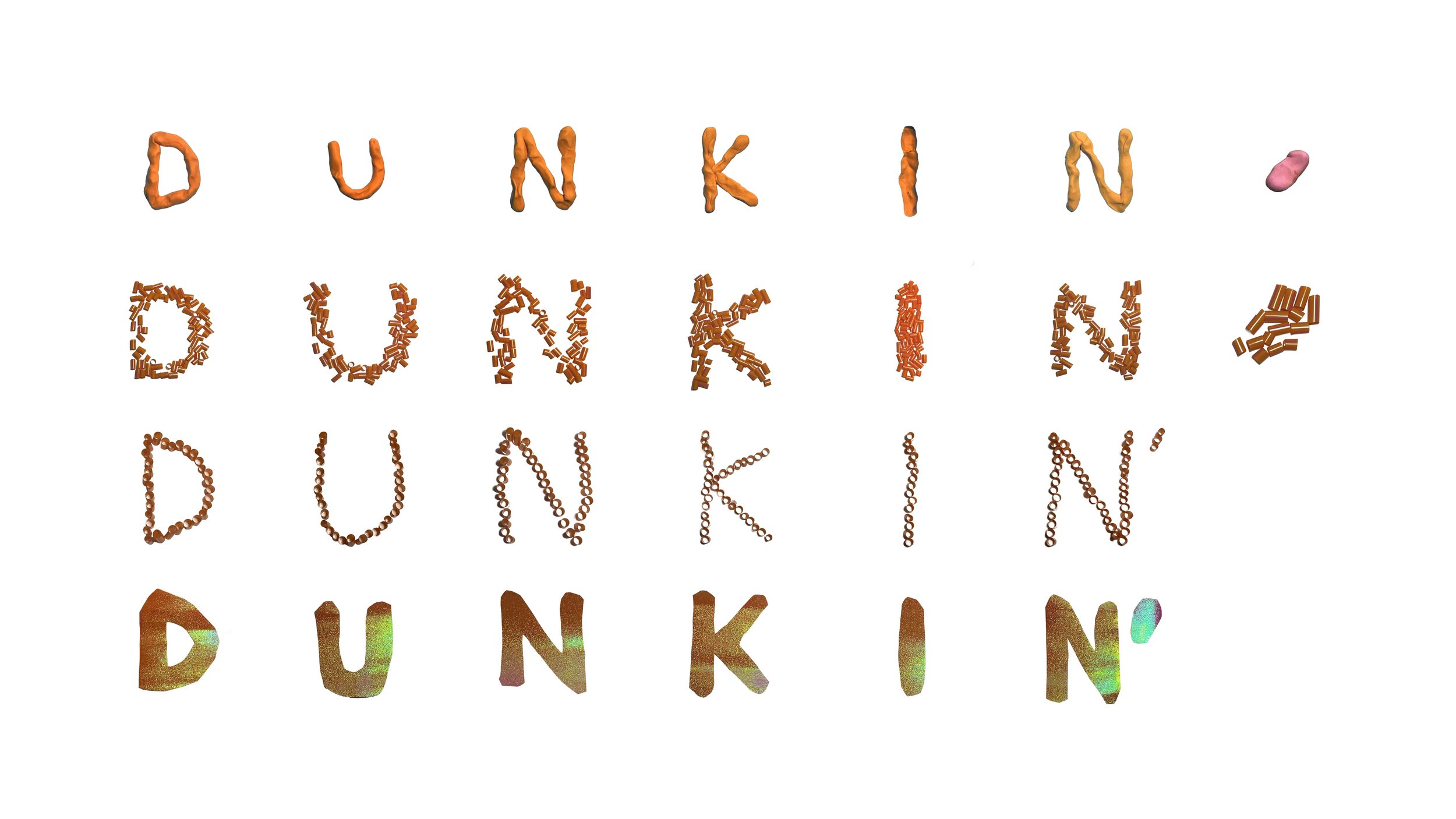
With my favorite donut brand, Dunkin, I wanted to show that people don't just use plastic containers once and throw them away, but recycle them and reuse them for children's play and crafting materials. I also wanted to visualize the possibilities of how these materials that people call "trash" in their daily lives can be recycled into creative and fun content.
I drew on my own used Dunkin' wrapping paper, or cut up straws to create typography. I also photographed Dunkin' signs and logo images that I found on the street, reinterpreting the brand's image in everyday life. I saw this as a project that used the brand's physical products to discover new, immaterial brand values. In the process, I aimed to showcase the diversity of the brand, its logo, and its typography.


